LOGO RESEARCH
PARAMOUNT PICTURES
Paramount Pictures was established in 1912, the idea for a logo was drawn on a napkin by the founder William Wadsworth Hodkinson. It was later developed in 1914 to be the mountain and the 24 stars. The stars represented the 24 actors who had signed contracts with Paramount and the original plan for the logo was to add a star for every actor who signed on with paramount, however as the film industry was growing so fast, this became impossible to achieve. This was the original design:
On the 1952 logo, the mountain was drawn higher and more centered in the logo. A blue sky and clouds were also added to make a more creative, vibrant and colourful feel to the company. In 1957 it was developed again as Paramount started to head in the direction to minimalism. The logo was painted blue and some of the finer details in the background were lost.
1952:
1957:
The next major change to the logo was on the companies 75th anniversary in 1987. It was based off a painting that was used as a gift for the anniversary. A picturesque lake was added at the foot of the mountain, and the stars were made to have a realistic shining affect.
This is what the painting looked like that it was based on:
In 2002, proper animations were added to the logo which was in the form of shooting stars that flew over the mountain and stopped in their original positions around the mountain. This was to show the modernisation of the old company, and to add a 'romantic' and 'dreamy' feel to the opening of their movies.
The newest change was for Paramount 100th anniversary in 2017. The one thing that hasn't hanged through out the years is the mountain and the 24 stars. Power and reliability are two factors that mountains represent and that's why they have stayed the same with that because that is what they want there company to represent.
MGM PICTURES
The first MGM logo was made in 1924 and looks almost the same to the logo nowadays, however it has developed over time. When it was made in 1924 there was no colour and far less detail involved. As it was for silent films, there was no roar from the lion. The lion was chosen by the creator of the company Howard Dietz who named it after his almamater Colombia University who's spirts teams went by the nickname 'The Lions' After about 10 years with no roaring sound, a snarl was made by a guy with a gramophone recording in 1928.
In 1953 the logo was developed again to have a new lion that snarled and added more colour.
In 1966 they moved from a real lion to a stylized lion. It had a blue background that had a yellow-orange lion print on it.
This didn't last very long however and they went back to having a real lion in 168. In 1974 it was the 50th anniversary of MGM so they made a new logo with 'Beginning our next 50 years' written at the bottom, and 'Golden Anniversary' added to the sides in gold writing.
They updated the logo for the 60th anniversary and for the 75th.
75th Anniversary:
This was the version from 2011 that was updated to look more modern for the movies.
The most recent logo has been from 2012 up until now and thie following id the most recent from 2020. The logo has only had small changes over the years as they put a lot of value in sticking with the same face from 1924 to keep the company consistent. 'Ars Gratia Artis' was consistent through most of the logos as well. It is Latin for 'Art For Arts Sake' and this was also done by Howard Dietz.
WALT DISNEY PICTURES
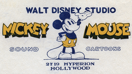
The original logo was a sketch that Walt himself made of Mickey Mouse. Then it moved into the calssic castle. The logo now almost always features a fairytale castle inspired by Magic Kingdoms, Sleeping Beauty's or Cinderella's Castle. It's undergone several changes since it's introduction, and it varies very often to match different films themes and tones. Disneys signature has also changed over time.
Signature: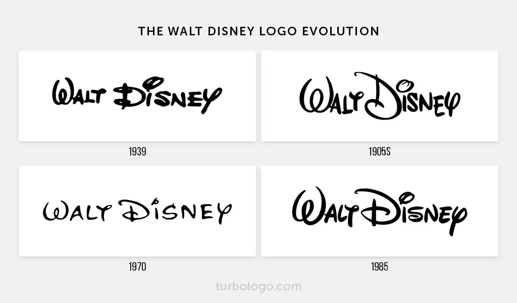
Original Sketch of Mickey:
Castle Evolution:
In 1937, the first castle was drawn a simple blue and white with Walt's signature. This was to represent the simplicity and innocence of the childrens movies.
In 1985 a dark blue background was added and the castle was kept white. A shower of light would descend from the top of the screen and the word pictures was added underneath walt disney. This was used til 1989.

In 1990 the updated logo had a slightly lighter background, and the castle is a light blue.
In 1995 the castle was made into 3d castle. This was to show that Disney was keeping up with the newest animation technology. This logo uses a computer generated facsimile of the castle and lacks the beam of light or segmenting from the older castles. It instead zooms out from the castle gates.
The last big change for this one was that instead of the song 'When you Wish Upon A Star' from Pinocchio randy Newman composed a new song for the theme.
This is the beginning of Toy Story 1:
In 2000, the colours were changed again to a dramatic black background and a bright orange beam which flew over the screen illuminating the castle and the words was introduced. The beam also is the classic arch.
In 2006 for Pirates of The Carribean: Dead Mans Chest, the next CGI logo was introduced and used up til 2011. It had a more realistic view, with a blue and pink sunset and a star which shines over the whole logo, travelling past a railroad and a river with a sailboat, Magic Kingdom, and then lands on Cinderella's Castle. Very often when this logo was used the background music was a modified version of 'When You Wish Upon A Star' from Pinocchio. Fire works have aslo been added.
The most recent logo was made in 2012. It's very similar to the 2006 one but the colours are more vibrant. There also isn't a journey past the Magic Kingdom, and no fireworks.
For heaps of the different films, the shade of the logo and the colours have changed to fit the mood and tone of the particular film.
Inspector Gadget 1 & 2: Atlantis: Lost Empire:

WARNER BROTHERS:
Warner Brothers has changed it's logo officially 13 times since it was established in 1923. It adopted a similar theme to Disney when they also change the mood and tone of the logo to match the particular film. They have done this over 200 times. Some of the official changes to the logo were to represent shifts in ownership. Like in 1966, when Jack Warner sold the company to Seven Arts Inc, they changed the logo, but then they went and sold it three years later to Kinney Services who also changed the logo up again and updated the corporate name. Since 1984, Warner Brothers have kept the shield and clouds in the logo, but the corporate name below the shield has varied. Some of the changed logos were also just attempts to freshen and modernise the look of the company. These were the main logos that were used:
1923-1929: 1929-1934:
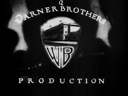

1934-1937: 1937-1948:
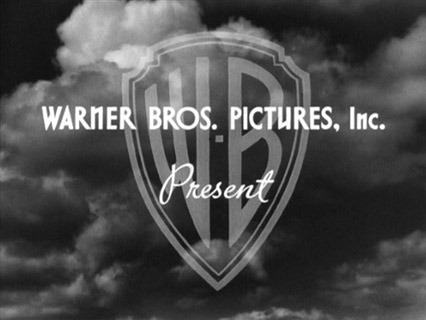
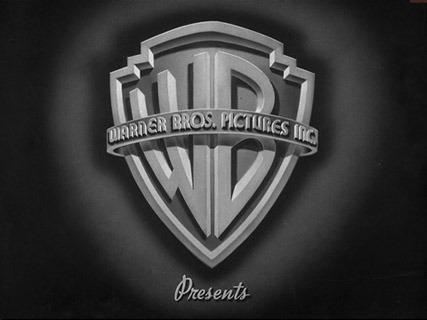
1948-1967: 1953-1956:
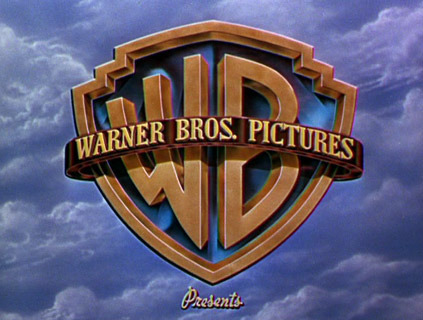
1967-1970: 1970-1972:

1970-1972: 1972-1984:
1984-1997: 1998-2010:
2011-present:
Some Warner Brothers Movies have their own specialised logo to matvh the mood and tone as I mentioned before. Some examples of these would be the Harry Potter movies, and Scooby Doo.
UNIVERSAL STUDIOS:
Universal was established in 1912 by Carl Laemmle. The first logos had no sound as they were for silent films, but they did rotate in place which was impressive for the special effects of that time. There were many different colours inbetween then and 1919 including black and white, green and orange. Universal means omnipresent which shows how Carl wanted to take over the global market, and this is also shown by the symbol being a globe.
Around 1914, the logo changed from the earth and stars to this til 1919. It's very rare to see this on a film, and it was accompanied either by the theme music of the movie or a violin.
Around 1927 the orange tint was adopted again, and a plane flew around it with the corporate name appearing behind it. This is what the logo was before the movie:
Another logo was added that had Carl's face on the globe, and it's extremely rare and only seen on the two silent films 'Smouldering Fires' and 'Head Winds' which looked like this:
In 1927, actual sound effects were added to the plane, and a 'The End" logo was introduced for films.
.
In 1936, a more extravagant globe has been introduced in black and white, and white and blue. This showed universal was heading in the direction of being more modernized, and making attempts to draw attention to themselves in the growing market.
.
In 1946, the earth adopted more natural colours (although some were still black and white) and a more dramatic song was played in the background. Universal was trying to stand out against other competitors in its field.
The 'Zooming Globe' was introduced in 1963 and showed the advances in technology and creativity for Universal as they made this new logo.
For it's 75th anniversary, universal made a logo in which all of it's old logo's played before the new logo was introduced. The new logo is very similar to the one that is used today, where a glint of light is seen coming round the globe, and the word 'Universal' flies around the world till it lands in the middle of the screen. This was to recognize where the company had come from, and to show how it had developed over the years.
In 1998, the 'Glimmering Globe' was introduced, and was named this because of the way the light shone around the globe as the words flew across the front.
This logo is the logo which was introduced in 2012. There is two versions of it as it was created for the 100th anniversary of Universal. Both were designed at Weta Workshops in New Zealand. The first follows a similar style of the 75th anniversary where all the other logos appear first, and then the new one shows up. The second one is the classic words flying around the screen and a simple 'Universal 100th Anniversary' is written.
.
The newest logo was made in 2020 and is similar to the second 100th anniversary logo, but doesn't have '100th Anniversary' written underneath it, only 'A Comcast Company' to show that Universal is under ownership of Comcast.
Hi Luci
ReplyDeleteOverall Score: 17/20
Well done on some thorough research for your logo concept. You have delved into the history of the journey of some of those well-known logos and laid that all out well.
Unfortunately one of the key aspects of this assignment was to comment on your own group's logo development to date. Sorry this wasn't included. just make sure you check and re-check the brief when answering questions. Otherwise, a well done research project with lots of visuals illustrating the development process, well done.